Articles » Web Graphic Design
What colors should i choose for my logo?

How important is color in a logo and how can it help, so that the company communicates its values in the most direct way?
Color, as though many times may seem inferior in comparison to the design, however it is vital. The main reason is that it works much more as a message than what the design to the subconscious and therefore it is easier to communicate the business goals to the public.
It is well known that people face various colors with a very specific manner whether they are aware of it or not. That is why when designing a company's logo, great importance should be given to this factor.
The graphic designer must implement the signal in different colors, having a specific palette in mind, and then determine what the specific tone will be, that will easily pass the message of the company, and also to what extent it should be placed.
The following list develops the way, in which each color is associated with various emotional responses:
WHITE

White is a color that symbolizes peace and purity. It is used mainly when stating the purposes of protection or negative space. One of the most notable examples is that of the WWF signal.
YELLOW

The brightness emitted by the color yellow and therefore the fact that it is easily distinguished from distance, is what sets it apart. Emotions caused strongly by it are optimism, clarity and warmth. One of the most popular applications of that color is the McDonald's logo.
ORANGE

This color is a mix between yellow and red, so it borrows the corresponding characteristics and combines them to create something unique, thus gaining attention. Orange gives a sense of creativity, enthusiasm, amusement, friendliness and confidence. Well known logo of this category is that of the VLC program.
RED
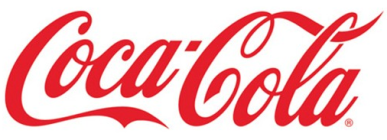
Red is the most intense of all colors. It easily catches the eye and causes feelings of enthusiasm, flushing and youthfulness. It is also combined with love and passion. Perhaps the most typical example of this category is that of Coca-Cola.
PINK

As is known the color pink is synonymous with femininity, while giving a sense of purity. The brand name of Barbie dolls is probably the best example of the use of pink color.
PURPLE

Concepts such as spirituality, mystery and wisdom are mostly expressed through the color purple. As a result of these characteristics purple is a color that strongly induces the feeling of awe. A company that has used this particular color for its logo is Yahoo.
BLUE

Blue is a calm color which is associated with vigor, success, security, trust and reliability. The majority of people likes at least one shade of blue, making it one of the most popular colors. An extremely famous blue logo is that of twitter.
GREEN

Green is soft and easy on the eyes and therefore a color symbol of life and renewal. Directly related to peace, health and development it is often used by companies that want to display a profile which is environmentally friendly. The Animal Planet channel chose to use not one, but three shades of green, passing a clear message of environmental awareness and consistency.
BROWN

By looking at brown images of nature and wood easily come to mind. It has the capacity to awaken feelings of tranquility and simplicity, but also power, wealth and seriousness. A typical example of this type of logo is that of UPS.
GREY

Gray highlights feelings associated with balance, neutrality and tranquility. Because of these features, in most cases it is positioned as a complementary color to various logos. But there are also cases when it constitutes the basic color of the composition such as for example in the case of Swarovski.
BLACK

Through black the concepts of power, threat and evil are mostly rendered. As a color it provides logos with strength. It can also be connected to simplicity, classicality, mystery, privacy, but also tradition. A famous logo of this color is that of the secret agent of action films 007.
A quick way to understand the importance of color in a logo is to try and imagine logos in different colors.
Would the McDonald's company inspire you if the letter "M" was gray, an orange signal for 007, or a blue Coca-Cola?
Surely the fact that they have been screened over the years in certain colors helps so that they are not easily accepted in a different way, but it is certain that if they had started in a mismatched color it would be more difficult to have the same success (and on the same time) than with the colors chosen.
And now, having analyzed all the basic color palette, you can more easily understand the message that every company wants to pass to the general public, even if it uses more than one colors in its brand.
So what goals do NASA, VISA, Google, FedEx or BMW wants to project?
By exercising your powers of observation you will soon be able to realize all the "hidden" messages, which every business wants to raise, and gradually gain a critical eye as a consumer, but also use your expertise to the benefit of your own business!