Articles » Web Graphic Design
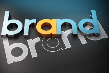
Shape: A key factor in logo design
Our subconscious receives constantly stimuli from the environment and responds differently to each of them.
For example, a straight line passes different messages than a curved one, as well as a circle is percieved differently than a square.
This is also true when it comes to logos. In order to understand them, the brain processes not only colors and types of fonts, but also various formats. The emotional reactions that arise are critical to the perception that the public will have for the company. A logo is strengthened, even if it seems simple, if is has been planned properly.
The most famous and widely recognizable logos have been designed taking into account these psychological factors. ΈThus it becomes easier to communicate the company's values and objectives in the clearest possible way. In this article we will analyze how we can use different shapes, so as to strengthen the capacity of our trademark.
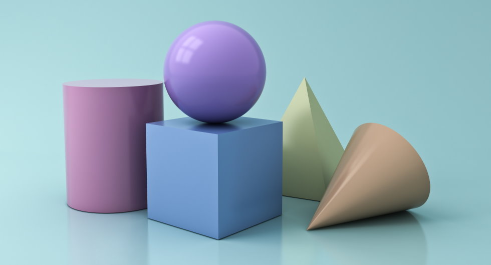
Circles, Ovals, Ellipses
Such patterns are intertwined with positive feelings. For example when using the shape of the circle the concepts of:
- unity
- friendship
- and love
are highly indicated.
Moreover the curves of any kind are usually associated with the element of the female in nature.
Triangles, Squares
Shapes with perfectly straight lines, such as triangles and squares, convey meanings of:
- consistency
- and balance
All logos which use straight lines also aim to show information such as:
- capacity
- professionalism
- and efficiency
The brain also connects the triangles with:
- power
- science
- religion
- and law
Unlike curves, triangles refer to the element of the male and that is why we often encounter such shapes in logos of companies that are in the male products business.
Vertical & Horizontal lines
The messages received by the subconscious when processing vertical lines in relation to when facing horizontal lines are diametrically opposite. Vertical lines indicate concepts such as:
- strength
- aggressiveness
- and masculinity
Instead, the horizontal lines bring out mostly concepts such as peace and unity.
Font Style
Letters are no different. They are also shapes and follow the same rules.
Fonts with many angles cause a sense of:
- aggression
- and dynamism
But if we observe fonts with more smooth and rounded outlines we have the sensation of:
- a mellow atmosphere
- and youthfulness
Often fonts with bold, strong letters are addressed to men, while curved fonts and calligraphic letters tend to turn to the female gender.