Projects » Web Graphic Design
Creation of logos for the Federation of Bank Employee Organizations in Greece
OTOE - Corporate Identity
-
 The logo of O.T.O.E.
 -
-
 INE OTOE Logo
 -
 O.T.O.E. tv Logo
 -
 Color palette of all O.T.O.E. logos
 -
 The O.T.O.E. logo in dark background.
 -
.") The O.T.O.E. logo in black & white (GrayScale).
The O.T.O.E. logo in black & white (GrayScale). -
-

-
-
-
-
-
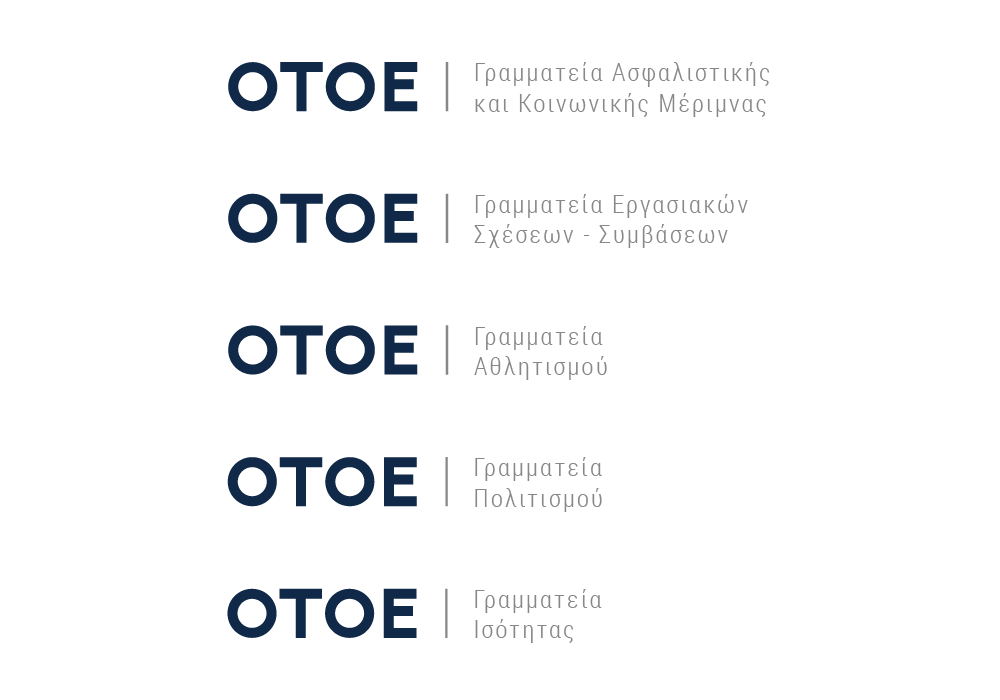
OTOE and individual secretariats logos
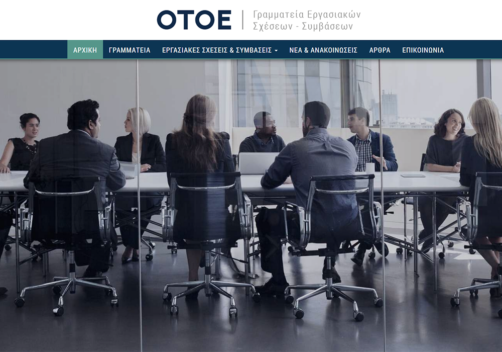
The OTOE logo is simple and easy to read. The aim was to reflect the gravity of a big federation. For this reason, it was preferred to use the thick font for the initials "OTOE". To the right follows the explanation of the four letters, in a much finer font. A vertical dividing line was placed between them to give more emphasis to the abbreviation. The separation of the abbreviation and the explanation becomes even more intense with the use of different colors. OTOE appears in dark blue, while the vertical line and the explanation have a soft gray hue.
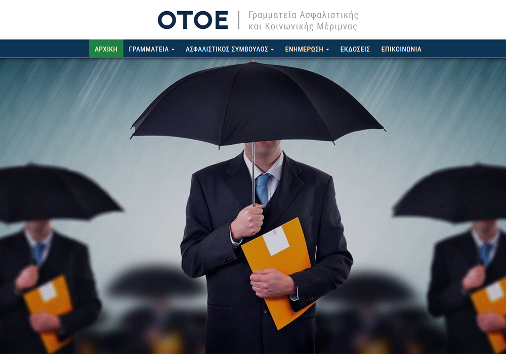
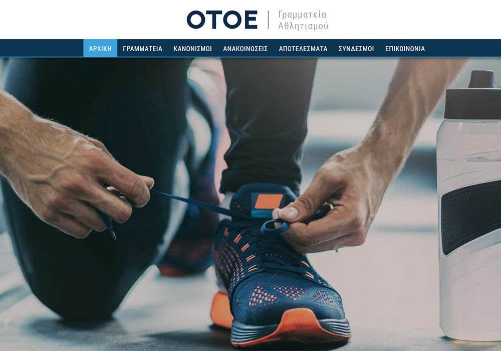
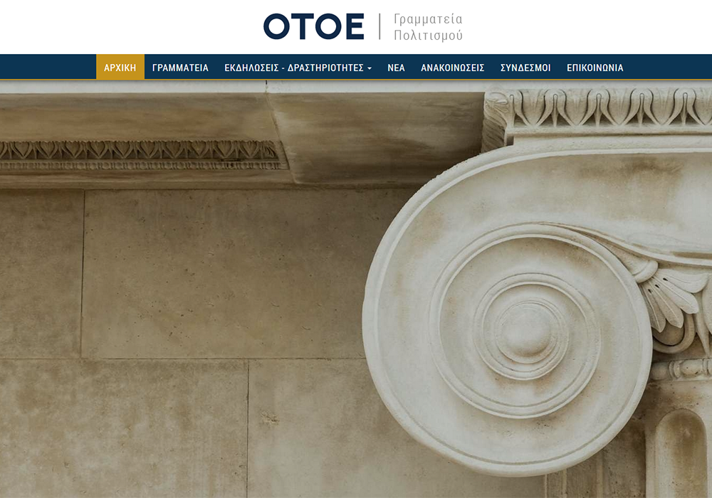
To preserve a uniform identity of the Federation, the logotypes of its secretariats were similarly designed. On the secretarial websites confusion is prevented by the use of different colors per secretariat.
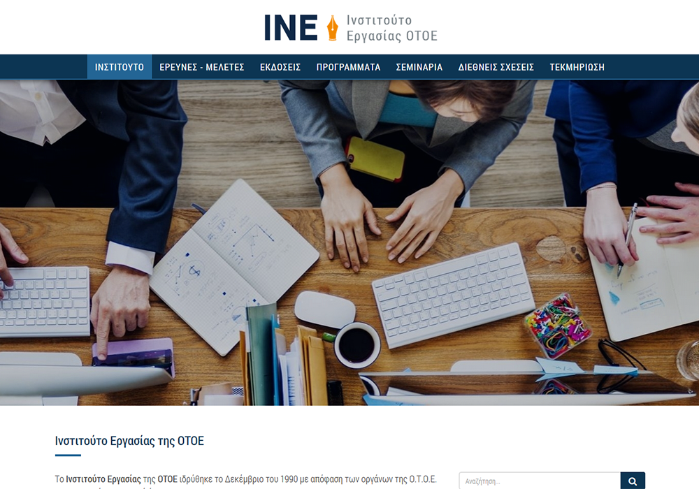
ΙΝΕ - ΟΤΟΕ logo
The OTOE Labor Institute's logo is similar to that of the Federation and the secretariats. The only difference is the replacement of the dividing line with the draft of the pen. The pen is orange, thus making the logo stand out.
ΟΤΟΕ TV logo
The OTOE TV logo is the most special of the Federation's logos. Common elements with the above logos are the abbreviation style, the vertical line and the explanation, in this case the word "TV". The element that differentiates the particular logo is the radio wave display at the upper left of the letter.
The color
The blue and orange colors are characteristic of the Federation, having been used before. Gray was added to flush secondary information. The dark blue color was chosen to emphasize important information such as the Federation abbreviation, the header and the titles of the web pages. Orange was placed as a secondary color on the OTOE's main website, and was also used in the logos of INE OTOE and OTOE TV. The reason why orange was chosen only for these two logos was that INE OTOE and OTOE TV are two areas of the Federation with a particular subject. It was therefore important to distinguish both from the OTOE and the secretariats marks.
Last but not least, in attempting to have a single profile on each OTOE website, but also to have a clear separation between them, each secretariat's website has a unique secondary color. Some of these colors were chosen based on what had been used on the previous websites, while others on the basis of color were siding versions secretariats.
Website construction
Along with the design of the logos, Webart also took over the construction of the Federation's web pages.
Relative Projects
 Bizoutis - Director logo
Web Graphic Design
Bizoutis - Director logo
Web Graphic Design
 Tetractys Technologies
Web Graphic Design
Tetractys Technologies
Web Graphic Design
 O.T.O.E. Websites
Web Development
O.T.O.E. Websites
Web Development
 MacArthur Capital - Logo renewal
Web Graphic Design
MacArthur Capital - Logo renewal
Web Graphic Design
 DAC - Business Consulting
Web Graphic Design
DAC - Business Consulting
Web Graphic Design
 Yacht Charter - Logo
Web Graphic Design
Yacht Charter - Logo
Web Graphic Design