Projects » Web Graphic Design
Logo renewal, icon design and creation of a business card and brochure
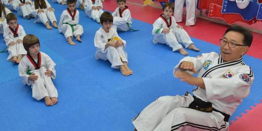
Pallini Force - Sports Association
-
 The logo of Taekwondo Athletic Center
 -
 Redesign of the logo, by replacing the fighter and putting colors
 -
 Color palette of the Athletic Center logo.
 -
 The logo of the club on a dark blue background
 -
") The logo of the club in black and white (GrayScale)
The logo of the club in black and white (GrayScale) -
 Icons creation for the basic activities of the association, so that they are in perfect harmony with the logo design
 -
 Business card design for the coach of the association, with all the necessary information
 -
 with all the information about the club for the year 2016.") Brochure design (flyer) with all the information about the club for the year 2016.
Brochure design (flyer) with all the information about the club for the year 2016. -
 Redesign of the brochure for the year 2017.
The association
The Sports Association Taekwondo / Hapkido - Pallini Force operates in the field of martial arts since 2014. The coach's vast experience on the sport resulted in the rapid spread of the club's reputation. This led to a need for an immediate renewal of the logo as well as the entire corporate identity.
The color
The main demand in renewing the logo was the placement of colors, which would give vividness to the composition. In order to find suitable colors, the principles of Taekwondo and the sport's dominating colors were extensively studied. These colors are yellow, red and blue and stand for neutral, hot and cold respectively. Red and blue were finally chosen, each rival and complement to the other.
The shape
The integration of colors in the composition led to the modification of the original design. The image of the fighter shortened, so as to be completely inside the circle. This process created two subtotals. At the top of the circle the red color was placed, in a way to symbolize the sunlight. At the bottom subset we put blue color, symbolizing the solid foundations of the athlete. The profit from this alternation of colors in the composition was the final balance of the total.
The letters were kept separated, by the two different fonts. The blue and red were able to put even more emphasis in this division. This time the blue framed the "Taekwondo", while the red framed the "S.A. Pallini Force".
Website development
Along with the logo renewal, Webart also undertook the construction of the site.
The initial collaboration I had with the Webart was in order to build a website for the Sports Association "Pallini Force" and the result was excellent. So, I decided to also entrust the design of brochures and business cards. The response was very positive, bringing new people to the club.Vasilis Sarabalos
Relative Projects
 Brand name & logo SportGeek - Blog
Web Graphic Design
Brand name & logo SportGeek - Blog
Web Graphic Design
 Kronos - Car Rental
Web Development
Kronos - Car Rental
Web Development
 Roussis Driving School - Logo redesign
Web Graphic Design
Roussis Driving School - Logo redesign
Web Graphic Design
 Beauty Center - Logo digitization
Web Graphic Design
Beauty Center - Logo digitization
Web Graphic Design
 Dr. Parousis - Logo Digitization
Web Graphic Design
Dr. Parousis - Logo Digitization
Web Graphic Design
 Pallini Force - Sports club
Web Development
Pallini Force - Sports club
Web Development